Burns Lake now has a new flag.
Mayor and council voted on some options they had been considering for the past few weeks. Initial versions had been on the council table a month ago, but a decision was deferred after councillors made some design suggestions based on what they saw.
None of the designs were presented outside of council chambers for public input.
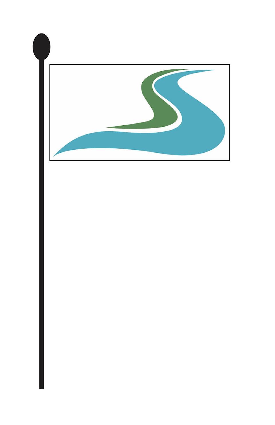
A flag design professional was not consulted, in advance of the decision. The design options, as presented to council, came out of themes gleaned from the town’s 2020 rebrand consultation processes, according to Village of Burns Lake chief administrative officer Sheryl Worthing. That exercise resulted in a new tag line “Carve Your Path” and corresponding logo. That logo’s chief element - the flowing curves that evoke both a lake and a highway - became the main image on the flag the councillors settled on.
“I think the swoosh (the lake/road symbol) is getting traction as far as people recognizing it,” said councillor Kevin White, to which mayor Henry Wiebe said “yes, it is getting recognized, and that’s a great thing.”
Councillors took turns expressing preferences among the options before them at their Jan. 10 public meeting. Alterations had been made from the previous set they’d mulled over, based on their December feedback.
“It’s a tough decision, because it’s permanent,” said White.
One of the deciding factors was a flag that looked the same on both sides. Had lettering been included (flag designers warn against this for a number of reasons) it would have been forward to viewers on one side but backwards to viewers on the opposite side. One can’t help the reversal of perspective, but the effect should at least be consistent from either perspective, it was agreed.
The North American Vexillological Association (NAVA) is the authoritative organization on the design of flags. They recommend five essential pillars of flag-making.
1. Keep it simple.
2. Use meaningful symbolism.
3. Use two to three basic colours.
4. No lettering or seals/coats of arms.
5. Be distinctive.
Worthing said, “We have included funds for a new flag in the budget. If the budget is approved by council, we will place an order. Budget deliberations start in a few weeks.”